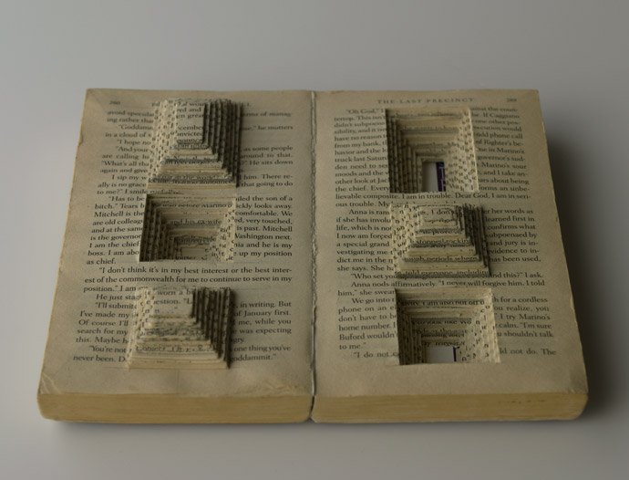
 Ryuta Ida is a Japanese artist and you can find some collections of her work at http://ryuta-iida.com/. I found this piece while searching for inspiration for my book alteration project and thought I would share it with the class. I particularly liked this alteration because of the spectacular use of negative space within the piece. When the book is closed tightly it would have an unaltered appearance but once opened would reveal the harshly defaced interior. The amount of precision work and time this would take really shows the artist's dedication. I suggest you take a look at her site and view some of her other work. It is quite fascinating.
Monday, October 31, 2011
Ryuta Ida
Ryuta Ida is a Japanese artist and you can find some collections of her work at http://ryuta-iida.com/. I found this piece while searching for inspiration for my book alteration project and thought I would share it with the class. I particularly liked this alteration because of the spectacular use of negative space within the piece. When the book is closed tightly it would have an unaltered appearance but once opened would reveal the harshly defaced interior. The amount of precision work and time this would take really shows the artist's dedication. I suggest you take a look at her site and view some of her other work. It is quite fascinating.
Picasso to Warhol

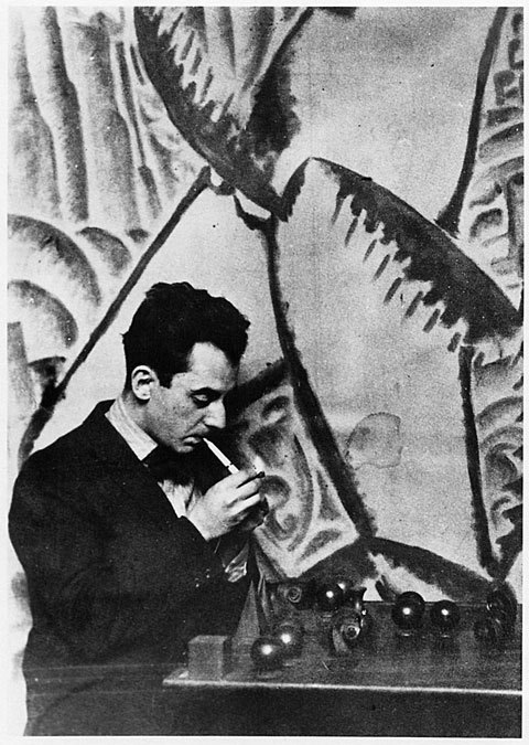
Constantin Brancusi Untitled (Double Exposure Self Portrait), 1933-34
This double exposure is an amazing image. It really makes me appreciate the old darkroom. This photographic technique implied in this self portrait demonstrates the artists personality and skills outside of the sculptural medium. Fernand Leger, Propellers, 1918
This painting is by far one of my favorites on display at the High right now. The fluidity that flows from the shapes allows your eye to easily canvas the piece without being all broken up by the bright colors. The harmonious combination of both the geometric and organic shapes really makes this painting dynamic.
*If you have not seen this exhibit, go see it! There is free museum entrance every first saturday of the month for Fulton Country residents*
Sunday, October 30, 2011
Frida Kahlo
 Frida Kahlo painted numerous surreal self-portraits that often reflected her physical and mental pain, products of an accident that occurred when she was younger. I think these really highlight the idea of the "self-portrait," embodying one's own feelings and inner self.
Moby Dick in Pictures


Former high school english teacher and current artist Matt Kish, has spent the past 500+ days illustrating each page of Henry Melville's novel Moby Dick. That's one drawing per page, per day for 552 straight days. “Friends often question my obsession with the novel, especially since I am not a scholar or even an educator any longer, and the best explanation I have been able to come up with is that, to me, Moby-Dick is a book about everything,” says Kish of his hobby turned artistic business venture.
Project blog here
The finished project can be purchased here
Saturday, October 29, 2011
Minimal Color Usage-POWERFUL
%20(2009)%20(web%20site).jpg)
Less can be more quite often when it comes to color usage. The values in Sharon Cutt's portrait are not super intense, but the color she does use comes across very intensional. She builds an intense image without traditional use of intense color. Check it!
Thursday, October 27, 2011
Mario Wagner
I recently read an interview on artist Mario Wagner and I must say that I really love this guys work. In a nutshell, his creative process is a mixture of old cut out images, some acrylic painting, and his mac for final touches.


Check him out more at http://www.mario-wagner.com/
Tuesday, October 25, 2011
Self Portrait
Man Ray, Self Portrait 1921
Man Ray is one of my favorite photographers. His images have this very soft and subtle look which gives the photographs an almost painted like look to them. He also has this great way of composing his images which make his images exceptionally strong.
Sunday, October 23, 2011
Vincent van Gogh, Self-Portrait
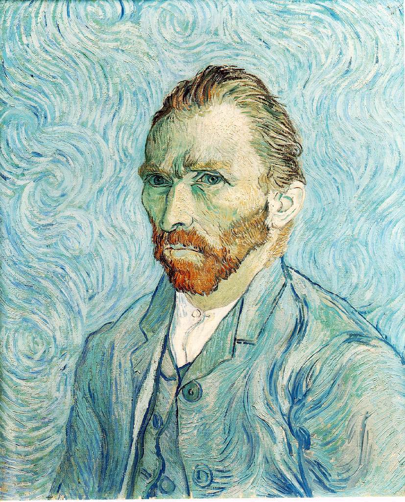 This is one of my favorite self-portraits done by van Gogh. His pose, position, background, and colors all are used to convey a extremely melancholy state for the artist. The colors of the background and colors of his suit jacket end up blending together, creating a wallpaper effect. Though, I believe, this is not lost on the artist. He uses this effect to bring more attention to his face which is accented with his bright red beard. Van Gogh clearly understood how to make effective compositions.
Saturday, October 22, 2011
A Conversation With Myself Part I

I came across this self portrait (photography) and it captured my attention in first sight. On Flickr I was able to find more self images of the artist. I found Hani Amir's style very unique and interesting. what i found most interesting about his photography is that he uses natural lights, natural poses and as less use of Photoshop as possible. he says "I can use the make the light burst on Photoshop but where's the fun in it?" I like his attitude towards artificial effects.
In this picture Amir uses mirror to get the reflection of other half of his face, he tilts the neck and sets the camera in such angle that in one shot taken with tripod gives the image of two people in which one of them is victim and the other one is potential killer but it's the same person.
In this picture Amir uses mirror to get the reflection of other half of his face, he tilts the neck and sets the camera in such angle that in one shot taken with tripod gives the image of two people in which one of them is victim and the other one is potential killer but it's the same person.
I love the subject matter of the photo, something i can personally relate to. Cherry on the icing is the perfect lighting and use of complimentary colors(Blue & Orange) with black. Even though he used complimentary colors it doesn't give an extreme highlight and they are not "in your face" there is so much black that it takes over the colors. personally I am fond of black in most of my work because of the power of the color, so in every way i Love this self-portrait of Hani Amir.
Tuesday, October 18, 2011
Photographic Self Portraits


These are all really great photographic self portraits. I really enjoy how each portrait is drastically different from the other, and you really do feel like each one is successfully digging deep into the artist's personality.
Sir Cummings

Talk about some righteous color usage! E.E. Cummings is often more well known for his writing...but look there he was an incredible visual artist as well. Check out the crazy use of different colors combined with line. Pretty great yo!
Acrylic on wood pannel
 Sylvia Ji, Black Domina
Sylvia Ji is an amazing an amazing painter. Her use of color and detail is fascinating. In this image in particular (and other similar ones) the "dia de los muertos facial makeup" is extremely detailed and the delicateness of the way the paint has been laid makes it look as though this is the way the face was supposed to be. I also very much enjoy the color combinations she uses to make her work stand out.
Life and Death Around you

This image is done by alex gray. It has a unique way of encapsulating the viewer with a trippy way of using the negative space. The artist used the negative space along with a unique blend of colors to put in many different faces. How many faces can you see?
Monday, October 17, 2011
all of the lights

Urban Lights Writing The Story Of A Dream by:
Manu Pombrol
you can tell that the picture has been altered, but its not only the alterations that make it interesting. the basic photo has a few illusions of its own. the angle contributes to the appeal, it makes you look at the whole picture instead of just glancing over it. the distance between the person and the building makes it seem like they might be the same size. now the alterations give it more color and a modern feel. the bright and streaking lights gives the picture the feeling that even though this might be a busy city some times your own personal moments are all that matter.
Judith Leyster
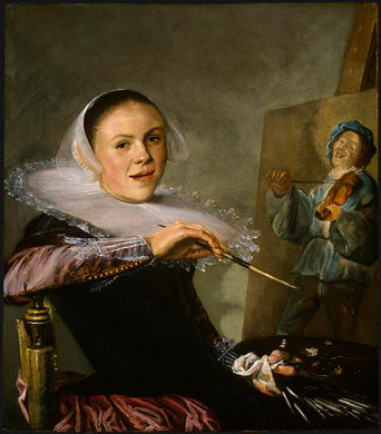
This is a painting from the year 1630 by the Baroque artist Judith Leyster. I find the painting to be very intriguing for several different reasons. She paints herself in the middle of a painting that she is working on to show that she is an artist and to tell something about herself, yet she is not wearing the clothes of a standard artist. She is wearing a more formal and traditional outfit from the time period more suited to the upper class. The painting she is working on is actually a portion of one of her earlier painting which also grabs the attention of the viewer. The contrast between the darks of her outfit and the bright white of the accessory around her neck really stands out in the painting. The accessory really helps frame her face and draw attention to the most important part of the painting and then you follow down her hand and the brush and notice the painting in progress. The composition really helps direct eye flow around the painting in a flawless manner.
Sunday, October 16, 2011
Rembrandt

Rembrandt was a dutch painter whose primary focus/success dealt with portraits. This portrait is an example of a typical piece by Rembrandt done in 1634. What caught my attention from this artist is that on many sites about him, the authors all wrote the same thing... that his self portraits were "unique in that he surveyed himself without vanity and with the utmost sincerity." I think that this relates directly to what we are currently doing, as we begin our own self-portraits, and it's an interesting technique to look at ourselves without vanity, and focus on what others actually see rather than what we'd like ourselves to portray.
MiraRuido

Spanish freelance illustrator, Joseba Elorza creates his art under the pseudonym MiraRuido, which translates to "look noise". His work has been commissioned for the Wall Street Journal, Esquire magazine, and Golf digest amongst other publications. Much of his work features black and white photography (mostly vintage) juxtaposed against colorful backdrops and landscapes (though not always). The photography is often manipulated in ironic, humorous and abnormal ways, as is the case here with his piece entitled, "Trunk". Trunk is a piece currently featured on the website poolga.com, which specializes in iPhone, iPod, and iPad wallpapers.
Jackson Pollock

Jackson Pollock is known for his dripped and poured paintings. Most of his pieces, like this one, remind me of the stencil project. The use of color in this particular one makes me think he used a special palette like we did to convey a certain emotion. This particular color scheme makes me think that he was going for a sad/upset type emotion, like he was confused. The color mixed with the composition (which is just all over the place, crowded, active, etc.) accentuates those feelings of confusions to me! It's a very interesting piece of art!
The Dream
 My older sister recently introduced this image to me by a young artist named Minjae Lee. She is from Jinhae, South Korea and only 22 years old. Not only is this an amazing image but almost perfect for our most recently assigned project. She utilizes line, shape, color, composition, and shade in such a dramatic way that brings so much detail and intrigue to the piece.
 Different lines and shapes make up the girls hair and eyes that build a beautiful designe on their own and the shading in her face make her look so realistic. The pop of color that morphs into her hand enhances a sense of imagination and her facial expression brings out wonder and question.
This is such an inspiring piece to me and I highly recommend checking out more of Minjae's art. RENOKIM.COM
Minimal Beauty
The use of Douglas Walker's line work is rather elegant and beautiful. It reminds me of a porcelain doll of china combined with modern day graffiti. Check it!
Portrait
 Alex Grey, "The Shulgin's and Their Alchemical Angels" #4
Alex Grey is an amazing visionary psychedelic artist and his works in their entirety provoke many feelings and thought. His works are The compositions and color selections more than aesthetically pleasing and demonstrate an extraordinary talent. He paints with anatomical precision and really allows for your mind to wander through the piece and appreciate everything it has to offer. If you have not yet heard of him CHECK HIM OUT! also if you weren't at his event this past weekend you missed out on an extraordinary experience.
Saturday, October 15, 2011
Self-Portrait

This is a self-portrait by Sofonisba Anguissola. It has a very well-set-up composition. The subject is slightly off-center. This keeps the painting interesting, while drawing attention to the easle on the left. The eye immediately is caught by her face, the painting on the left, and her hand because of the high contrast between the lights and darks. Anguissola uses a roughly triadic color scheme. The colors she chooses are subdued which, together with the dim lighting, gives the painting a very soft feel.
Monday, October 10, 2011
Composition

Michael Freeman, Jie GIrl
This photograph was taken in a Jie village in southeastern Sudan, where arms are common because of rivalry with other ethnic groups. The girl is grinding sorghum while an assault riffle lies casually propped nearby.The juxtaposition in this image was created by moving in close to the rifle and using a wide angle lens, which helped add depth to the content.
silhouette

Storm-Silhouette
by: Sebastian-Alexander StamatisI find this picture interesting because it uses the rule of thirds but it's not completely obvious.
I like that it has elements of movement mixed with a majority static subject. the contrast of having the lightest part of the picture in the middle highlights the rest of the four-ground. the person and the rock create the horizon line but it also gives the illusion that they are at different distances.
Saturday, October 8, 2011
Use of Color

Paste-Up
Artist: Roufixte Designers Productions
Thessaloniki Greece
This paste-up is of the iconic image of torture from Abu Ghraib prison is being used to attack the Bush war by being parodied as a christmas card. The use of these complimentary colors in this image makes it pop and really stand out even more than it already does as a solid black image. The anti-Americanism is emphasized even more through the selected color scheme and the elements included in the composition.
peac.drugs.music

This piece which was created by Jean Francois Detaille who is standing in front of his art depicts an inner feeling of true expression. This artist take his art to a whole new level by creating his pieces in front of a live audience. He inncorporates music, comedy and audience participation to help encapture an art entertainment show. This piece was created in only six minutes. but is uniques style is bright and has a great use of colors.
Thursday, October 6, 2011
Color Shazam!
We talk an excessively large amount about color...so let's continue.

Bernard Lorjou is a french painter man. Nearly most of the information on the man is in French and this poses an issue...but for now all we should concern ourselves with is his work. He relies quite a bit on the use of complimentary colors in his paintings. Take a look at this one for example:
King David:
Wednesday, October 5, 2011
Fiona Bell-Currie
 I think "Fox on the Outskirts" by Fiona Bell-Currie exemplifies some of the elements we've been working on and trying to achieve in our recent photo project. This may exhibit a complementary color scale of sorts, with the faded blues (and varying tints of blues) and the tawny-orange of the fox. Utilizing color, the painting allows the fox to pop out from its scenery, separating it from the background; the cold background colors and the warm colors of the fox might be described by a feeling like loneliness or sadness, maybe. What could be considered negative space around the fox seems to reinforce the feeling this painting could be trying to entail. The perspective, as well, magnifies this theme by making the fox look very small compared to its surroundings.
Tuesday, October 4, 2011
Raymond Jonson
 Artist: Raymond Jonson
 This painting utilizes a similar concept to our stencil project. It relies on basic shapes and color to create the composition of the piece. There is a limited and dull color palette in the work with the red popping off the page and creating two focal points within the painting. These focal points help lead your eyes around the painting and take notice of the subtle pink and yellow rectangular shapes as well. The black in the back works as a background and also through the use of the negative space creates its own unique shape separate from the rectangular shape of the other pieces in the composition. I think this is a very successful painting and accomplishes a variety of ideas using only the few shape variations and colors.
Monday, October 3, 2011
Fiammifero
 "Fiammifero" which means fire flame is a photograph by Chema Madoz. In this photo as we can see the wood design and a single burned matches is used to display matches' flame within the wood which looks real; the only way to tell it isn't real is because we KNOW that it is not.
 The artist stands for unusual photography or i rather say usual objects combined unusually to form a new perception of reality. Madoz's photography depicts exactly what we are asked to do in our photography project. His compositions are unique and his perspective on everyday objects is exclusive and distinctive.
Sunday, October 2, 2011
Forced Perspective
 In class the other day we discussed how shooting one subject from different angles can change the overall composition, as well as its overall feel and tone. This discussion reminded me of forced perspective photography. This technique uses optical illusion to make objects appear to be smaller, larger, nearer or further away within the image.
More examples can be seen here.
Photo: maybemaq
Subscribe to:
Posts (Atom)