Monday, February 20, 2012

Mastering Scale-Antonio López García

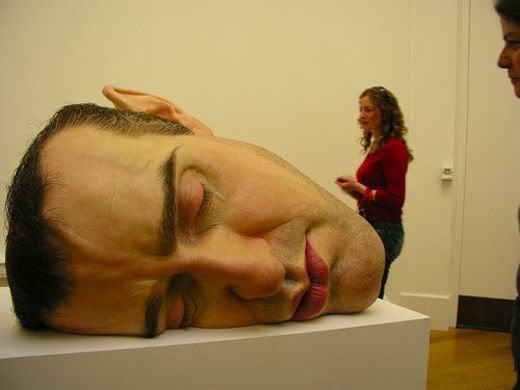
Scale often can be tricky because of the enlargements/reductions an object goes through to get the final product.  Antonio López García is the mastermind behind this giant head sculpture. He often enlarges humans/parts of humans and creates a realistic sculpture as seen above. The Spanish artist scales up the body and uses realistic touches to give these sculptures an edge. Antonio pushes the boundaries throughout his works perfecting each and everyone of the sculptures.

Sunday, February 19, 2012

Colorful Collage

Emilio Pucci had made his career creating clothing out of colorfully collage prints. They remind me of the stenciling work we are doing in class. Using repetition of color and composition he creates unified fabrics to complement his designs.

This is an art piece by Ryohei Hase that's titled Can not prevent it, but there is no need to prevent it. This composition is very successful in conveying a variety of emotions. The setting of the of the dark and somber sky and the buildings in the background accompanied the umbrellas in the foreground work to make the individual in the center of the piece stand out. The dark neutral colors help to convey a sad despairing type of emotion while the bright colors of the flame contrast the background to make it stand out, and provide an everlasting or persisting type of emotion especially with the rain that usually puts out fires.

- Andrew Chen

Thursday, February 16, 2012

 
Picnic Pallete, Martha Crollins, 2006

In this piece, Martha Collins examines the tints of red, white, and black, like we have in class. While she didn't go fully into black, she show an array reds, whites, and reds with both white and black. It overall looks like a picnic cloth. I think the diagonal creases/lines in it make it more interesting.

- Taylor

Tuesday, February 14, 2012


Flesh by Jenny Saville

A lot of her work revolves around decapitation, body modification and transformation through "less-than-trustworthy" sources. Her past works have been only done in reds and blues and colors created by the flesh. However, her newer pieces, such as this, have used white and red more frequently to underline the cathartic, revelation aspect of her work and not only do the colors draw you in, but the also push you back too.

- Taylor.

Monday, February 13, 2012

Blue Period

I choose 'Melancholy Woman' by Picasso because he utilized color to create a mood or emotion. Without even looking at the title the painting feels sad. The palette perfectly complements the woman's expression.

Sunday, February 12, 2012

Egon Schiele, portrait of the painter Anton Peschka has a feeling of loniness and introspection it almost seems as if Anton the subject is feeling regret. The mood is a bit gloomy the color palette is pale and unsaturated. The composition is empty having the only shapes standing out the head and the body blends into the background.

Mountains

I chose this painting of the Smokey Mountain landscape because it uses warm color combinations to create the feeling and imagery of the Fall times.

This is an abstract painting of two whales by Riccardo Guasco. This artist tends towards a limited color palette using an analogous color scheme of yellow, orange, and red, and also using black, white, and gray that creates strong contrasts throughout the composition. This composition also provides some asymmetry between the two whales that creates more interest between the two. I like this painting because it seems simple at first with the use of flat color planes, but is very successful at leading your eye around the composition.

- Andrew Chen

Wednesday, February 8, 2012

House on the Hill


           Damon Freed, an artist based in St. Louis, centers all of his recent artwork around patterns and asymmetrical relationships. This piece, titled House on the Hill, uses the image of the toilet to throw off what would have been a relatively symmetrical piece (If the painting is divided diagonally, the target-like object, purple- striped middle, and images of houses split, roughly, in half. Each side contains the nude backside of a human with red beneath the figure and green everywhere else). The asymmetry from the toilet and the opposing genders on each side creates enough tension to make the painting interesting.

Tuesday, February 7, 2012

Almost Symmetry


This painting, "Starry Night Over the Rhone," is an example of almost symmetry. Van Gough created a symmetry background and added a dock and a couple offset in the foreground. They pull the composition away from being to symmetrical and add interest.  

"Starry Night" by Vincent Van Gogh is a perfect representation of the use of color. He does an amazing job utilizing different shades of blue, yellow and green. Van Gogh is able to paint this masterpiece with an almost entirely blue composition without it blending together and becoming hard to comprehend. His use of perspective, brush strokes and color make this piece an exceptional work of art.

Monday, February 6, 2012

Travelling Companions

"Travelling Compaions" by Augustus Egg in perfection of its symmetry — the identical billowing dresses, the hats perched on the laps, the brunette-framed faces that face one another like a woman and her mirror. In fact, it might at first compare to some children's puzzle, in which one must point out the few things discrepancies between the one half of the image and the other. But as one begins to look, one finds a greater diversity of detail than is first apparent. One sits with a basket while the other sits with a bouquet, one reads while the other dozes, and outside the window a vivid and varied landscape expands, filling the center of the image.

This painting shows the use of near symmetry to create movement around the peice.

Sunday, February 5, 2012

Los Heroes Building

Located in Santiago, Chile this 70s modern styled architecture building, designed by Murtinho y Asociados Arquitectos offers pleasing design and color ascetics. Recently this building underwent renovations to update a once dated building. Now not only does the building offer an interesting pop of color but also lends a hand to the environment by the use of solar panels in the colored glass panes. Finally modern architecture combines color into the scheme offering more variety in the mix.

The Massacre, by Renato Guttuso

I chose this painting titled, The Massacre by Renato Guttuso because I believe it shows the Crowded technique very well.  It not only shows that by having a lot of things going on in the piece, but also by the subjects that he chose to crowd together, human beings, which by nature if put into a situation like this we would feel crowded

UP to No Good

In this playful collage by Hilary Pecis the strongest element of this piece would be its sense of crowdedness in its composition. There is depth to its crowdedness by have objects overlap and recede in space. There is also a business to its compositions with having several actions going on like explosions, airplanes flying and random goats occupying space.

Saturday, February 4, 2012

Theo Fehausse, "Blades"
 
In this piece, Fehausse uses ink stamps to create a somewhat crowded composition of blades. It's interesting because it looks like a homogenous whole at a glance, but really there are two main varying blade shapes. I think the proportions of the mass of blades and the negative space is effective in not taking this to a really crowded level.


Wednesday, February 1, 2012

Cat and Mouse


Paul Blow is a Scotland-based illustrator who plays up ironic, unexpected objects through contrasting colors. His otherwise-typical subjects become intriguing, vibrant, startling, and sometimes funny representations of Blow's imagination when Blow finishes with them. His limited yet powerful color palettes bring focus to key items in his works without boring the viewer.