Sunday, October 31, 2010
Cheese Puff Elvis
http://www.youtube.com/watch?v=SXigfZGqsLM
This is specifically for Chuck, but I think everyone can enjoy. An exploration of different media, this shows what you can do with delicious foodstuffs and black velvet. Think outside the box, people. Paint with all sorts of weird crap.
Friday, October 29, 2010
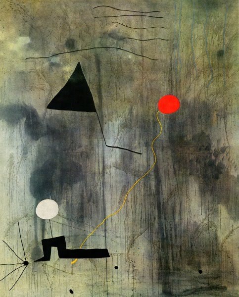
Still life

This piece is by Joan Miró. It is titled Still Life with Old Shoe. It was done in 1937 and it is now in The Museum of Modern Arts, New York, NY, USA. This is an abstract version of a still life. The colors and shapes are different than they were in the real still life. This makes this piece more interesting. The fork reminded me of the fork in one of the still lifes in class and i like how it looks here. The background and color add movement to this picture.
THIS IS AWESOME IN ALL CAPS!!!!!

i just found this and wanted to share it cause its super fuckin gnarly but it has nothing to do with class, i just like it a lot....
Thursday, October 28, 2010
Cryptic Diptych

I actually found this painting for sale on craigslist, which may be frowned upon by art elitists. I do think this is a strong piece, though. Compositionally, it works to have all of the spermatozoa (or neurons? these are two things I typically look for in art, I guess, and two things I find to be somewhat visually synonymous) congregating in the center, and having the painting split down the middle creates tension. You want this to be one painting, but if it were it might be less interesting. It works. The illuminated sperm cells are especially beautiful. Maybe the whole idea of the piece is supposed to be one big play on words... "Dicktyp diptych"
Tuesday, October 26, 2010
"The Last Stand" by Mary Kay
http://www.deviantart.com/#/d31jzzo
Every once in a while an image shows up that just makes you stop and really LOOK at it. "The Last Stand" by Mary Kay does just that, bu showing off an amazing derelict ship at sunrise. The image seems to perfectly capture the light reflecting off of the water and the texture of this ship's rusted metal frame. The piece is also very strong in its composition, with the sun's rays occupying the right side, the dark presence of the ship on the right, and the rocks cascading from the right downward.
Monday, October 25, 2010
Seeing things a bit differently
 "Corolla Fallujah", 2009
Digital silver gelatin print on fiber based paper, selinium toned
(Richard Mosse)
By conventional standards,Richard Mosse's photograph, does not fit the stereotypical view of what is considered to be a still life painting. For starters it doesn't consist of the standard fruits, jug and flowers composition but instead imagery is submerged in a bloodbath of bullets and subject matter is politically charged. As its title suggests, Fallujah is not only an insurgent stronghold but is a haven for terrorists and it symbolizes the various internal and external conflicts that surround the Iraq war. An epic center for violence, safety is paramount. A car becomes a real necessity for quick and safe transportation in and out city but it is also a vehicle, both literally and figuratively, in keeping one alive. It is quite interesting that Mosse juxtaposes these realities on top of one another. Image is even more interesting as car in picture is not just an ordinary car but an American car, a corolla to be exact, which makes it into a living target. It is no accident then that car is disfigured by the overwhelming spray of bullets. It is overkill and Mosse doesn't mask this fact--he doesn't shy away from the ferociousness and brutality of violence. This gesture is undeniably a scathing indictment of war.
 "Hoping the Light will save us 2", 2008
Diptych/Installation View, Carleton University
(Pascal Grandmaison)
Pascal Grandmaison diptych installation is quite interesting. At a glance it shows a face of a man but on close inspection there is something odd and asymmetrical about composition. One is upside down and the other upright but together it feels balanced and doesn't make you feel disoriented. I am not sure exactly what it means but you feel that look of man is piercing --you feel that you cannot escape his reach. The intensity of look is downright uncomfortable. His intense glare does something to your nerves. Somehow eyes seem to tear at your unconscious beckoning you to step out and come into view--stepping out and coming into the 'light'.
Still life watercolor painting

This water color still life was painted by Derek MCcrea. I like how only the corner of the table shows when it could have been straight across. Im so impressed with how he handled the lace with water colors in the background. The shapes are so delicate the beautiful. It's my favorite part to look at. I kind of looks like he painted the red shapes to create the lace. That impresses me. There is so much detail on the vase which looks difficult as well.
I love the look of water color. The colors blend in an interesting way. Like on the leaves and the red on the walls.
Michael Naples- Apple Orange Diptych
 Oil on 1/2" Board, 3.75"x6"
"Each painting is meant to be framed separately and hang next to each other allowing each composition to compliment the other."
I thought this was an interesting play on a still life diptych. It appears as though each object is half of a whole piece of fruit, however, this is not the case. The choice to do an apple and an orange is interesting in that the audience immediately thinks of the connotation of "different as apples and oranges," even though they add together to make a complete composition.
sumthin dif'rent


Here's a couple different examples I've found for diptych ideas. with the exception of the football pinup one, the other two tell stories within two images, and both are a little comical. anyways i dont really know what im gonna be doing for the project yet, but im sure some things will come as i do a little more research/image surfing. anybody had any good ideas yet?
Connor Walton- Still Life Judgement VIII
 This still-life painting was done by Connor Walton. The only word that comes to mind when looking at it is "Amazing". It looks like a photograph. The attention to detail is very intricate and the shadowing is perfect. Everything looks perfect, each line is perfect. Connor Walton is originally from Dublin, Ireland and a modern day classical painter.
Sunday, October 24, 2010
W.C. Heda- Still Life with Oysters, a Silver Tazza, and Glassware

This is a still life by W.C. Heda. It it a very realistic version of a still life. It has a very dark feel to it and has a dark color palette. The composition could be a little more interesting and less straight on in my opinion however I do like that the table goes out of view on the bottom and on the right.
An Urban Landscape
 the artist uses the diptych technique very well because it actually adds something to the piece. It is not unnecessary, the split panels heighten the shadow of the skyscraper and add a level of depth that would not be achieved if the artist hadn't used the diptych technique.
Friday, October 22, 2010
Diptych

This painting is called"Genesis 1:24-25." It is by Tina Bradford and its size is 60 x 40. This is a nice example of a diptych because there are two different paintings but they are so similar they read as one. The colors and the painting style are the same on both pieces but the space filled up is a little different. I like the dark red color of the trees against the lighter background. The lake and the reflection are also very interesting and I like the fact that it is also red. The lake almost connects which also helps make the piece read as one.
Pyramid of Skulls - Paul Cezanne
 Obviously, Cezanne did a lot of still life paintings. This one particularly catches my eye because of the subject matter. There are no apples or oranges, no vases, and no dainty little trinkets, which is what I generally think of when I hear "still life," and which are the objects Cezanne seems to have used most often. There are merely four well-placed skulls. The composition is nice, in that it is slightly centered but not completely. It hints at what is in the shadows although we cannot actually see this part of the painting. Good work, Paul.
Thursday, October 21, 2010
Forever Always - Octavio Ocampo

One could spend large amounts of time figuring this piece out, its composition and layout are visually astounding. I really love art that trips you out and take more than just a few seconds to register what is actually going on.
p.s.
Where the fuck was everybody last night, not even one of you showed????
Its cool i didn't really give you guys much info, but you missed out, and you can still come see the artwork all month at East Side Lounge
Wednesday, October 20, 2010
Self Portrait

This is a super cool self portrait that hangs in the modern museum of art at the Atlanta High. The artist worked in an  airplane hanger, placed found objects to create the image then had it photographed from a crane. I was hoping the photo that I took had the artists name in it - sorry! Chuck and I are planning to see the Dali exhibit at the High and I will be sure to update this post! Please, standby!
 airplane hanger, placed found objects to create the image then had it photographed from a crane. I was hoping the photo that I took had the artists name in it - sorry! Chuck and I are planning to see the Dali exhibit at the High and I will be sure to update this post! Please, standby!
 "American Gothic" by Grant Wood


The title of this piece is called "American Gothic" by Grand Wood. It was painted in 1930. Grant Wood was an American painter. This is his most famous piece. Linda and I were driving through Eldon Iowa and saw a sign that said "American Gothic House" and we followed the signs to the place. We thought it was pretty cool. The couple in the painting are actually suppose to be father and daughter, even though a lot of people mistake them for husband and wife. Wood used his sister and his dentist as models.
Tuesday, October 19, 2010
"Robot Repair Service" by 'Rtil'
Laura Parker

Shown above is a multi-media collage that implements magazine cutouts and different colors of paint. I particularly find this piece attractive and appealing, partially because of its disregard for implied compositional rules. It is extremely busy, and there is hardly any central focal point. However, the sheer amount of parts in this collage make it into quite an impressive view into the complexity of cities. The fact that there in a strip of sky showing at the top gives the busy maze of city life a backdrop of calm, which helps to create interest in a more traditional artistic and symbolic way.
Monday, October 18, 2010
Art Sounds
The two art videos by Ulay and Marina Abramovic in "Aaa, Aaa" and Paul Sharits' light and sound installation "Shutterface" are exquisite examples of artists finding ingenious ways to make a profound artistic statement with just sounds. These verbal compositions have the same complexity and skill as if doing an actual painting, sound replacing the brush and paint and adding an evocative texture to pieces. It is simply brilliant in my opinion.
self portrait of Arshille Gorky

This is a self portrait by Arshille Gorky who is the supposed father of abstract art. I like this painting because it is very subtle, the light tan color outlined by black helps the viewer focus on the smooth shape of arshilles face. NO HOMO! The brush strokes seem very fluid and the complexion of the face is flawless.
Evan Hildebrandt

This abstract piece is by Evan Hildebrandt. Even though there is no figure in this painting, I think it's so beautiful. It's almost magical to me. I feel like I'm looking into space or the ocean when looking at the top of the painting at that dark blue swirl. I also love the lighter spatters on top of the darker paint, because it looks like parts of the piece are glowing. I'm still wondering what techniques he used with his paint. A lot of the piece look like liquid to me. I like how in some areas the paint doesn't mix.
Joan Miro, Birth of the World.
This piece is an example of Surrealism. Even though the color pallet is rather limited, I find this particular piece to be very alluring. The red dot against a greenish/grey background is what draws you into the image. Surrealism is supposed to attempt to tap into the unconscious and I think this piece does just that.
Sunday, October 17, 2010
Some Chemist Guy...
http://www.youtube.com/watch?v=3zoTKXXNQIU&feature=related
Corn starch is a shear thickening non-Newtonian fluid meaning that it becomes more viscous when it is disturbed. When it's hit repeatedly by something like a speaker cone it forms weird tendrils. The video was shot at 30 fps and the speaker cone was vibrating at 30 Hz which is why there is no blur. This is the original video with the actual sound of the speaker.
This is a very literal take on our last two assignments. This video shows that sound's effect don't have to be solely conceptual; they can be tangible as well. Yay chemistry!
Saturday, October 16, 2010
Cricket Diane C Phillips-Eye of the Shadow

According to Cricket -“Obviously, I love the ocean. Everyday there are new paintings of the ocean in my studio because it is the only subject I truly love painting, although I paint a lot of other subjects. It is also because I paint them from my mind which means I get to go meandering around the ocean without ever leaving home.”
Cricket achieves great color harmony (with the use of complimentary colors) and balance with her collage paintings.
Besides it looks like a flying saucer at the bottom- any painting with a flying saucer is cool in my book.
Friday, October 15, 2010
Thaneeya McArdle

This is a piece done by Thaneeya McArdle and it is titled "Surface Reality." This artist wrote that a talented young musician described it very well by writing: "Surface Reality is music you can hold in your hand. It is music eye candy." I chose this picture because it reminds me of that first sound we had to listen to. There is so much going on in this picture it is overwhelming. The colors and designs are all over the place which is why I thought it went well with that sound. At the same time the colors are pretty and make you want to look at this picture and your eyes move throughout the entire thing.
"Arnolfini Portrait" by Jan Van Eyck

Jan Van Eyck was a Flemish painter. This painting is called "Arnolfini Portrait" and was painted in 1434. It is an oil painting. I really like Jan Van Eyck's paintings. He was very detailed in his work. In this painting, there is a mirror on the wall and you can see the reflection in it. It's a really nice painting.
Tuesday, October 12, 2010
Jackson Pollock - Portrait and a Dream
 This piece titled Portrait and a Dream and it is by Jackson Pollock. It is an abstract self portrait. Apparently the one on the right is him "when he is not sober". But I really like this as a self portrait and think really like these type of lines and strokes and ink.
"Now Arriving" by Matt M. Lakowski
http://fox-orian.deviantart.com/art/SYNTHESIS-Now-Arriving-109416575?q=favby:Negative-Crown-Ent/8996733&qo=5
"Now Arriving" by Matt M. Lakowski is a great example of using primary colors to really make an image stand out. The reds, yellows, and blues are all added together to make a very detailed and interesting piece to look at. Nothing seems out of place and the entire image works with itself to make something that is easy to look at and easy to comprehend without seeming underwhelming.
Monday, October 11, 2010
Brian Despain-Self Portrait
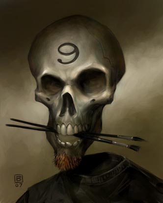 This is a self portrait by Brian Despain. I like it because it shows how you can show yourself without being super literal. You can tell he is an artist by the brushes in the skulls mouth, also he has a small beard. The work is eerie and creepy and the slight smile on the skulls face screams mischief.
Pierre Renoir- self portrait

This is a self portrait done by Pierre Renior. I like the composition because he used a dark shade to direct the focus on his face. He could of used lighter colors for his clothes but he didnt and they serve the same purpose as the background. A long gaze at the portrait gives off a sense of optimism because he isnt smiling but he isnt frowning, so it leaves one to wonder. An interesting fact about Renior is that he was handicapped by arthritis in his later years and he an assistant draw for him.
"Resurrection River"

This painting is by Krystyna Sikora. She created self portrait representing Jesus. Before I read the title, I could tell the emotion she was trying to paint was negative by the dark greens and heavy paint strokes. But there was also some white strokes. Then I found out she was trying to represent pain and suffering in this piece. I can see it in the chaotic stokes flowing in all directions. I like how she painted the cross and added hands holding weapons even though it's very depressing. The images aren't too obvious, so it took me a little while to find them.
Sunday, October 10, 2010
Dana Ellyn - Jesus Does His Nails

This is a piece done for International Blasphemy Day, which is a movement to dismantle the wall which exists between religion and criticism. It's aim is to open up all religious beliefs to the level of free inquiry, discussion, and criticism to which all other areas of academic interest are subjected. Dana. grew up with no concept of religion and was first introduced to the concept in college during her art history classes where the gods and goddesses of mythology were presented as fiction, whereas Christian themes were presented as history. Her art is both provocative and to some offensive, which is something I like a great deal and will eventually strive to incorporate into my own art as an Atheist.
Leonardo da Vinci - Self Portrait

I like this because of the facial expression. At first glance his brow looks furrowed, which would suggest he is slightly angry. After looking at it a while it seems like he is thoughtful. I like the sketchlike detail. He used red chalk to complete this self portrait Good job Da Vinci!
1512-1515
Self portrait

This is an abstract self portrait by Fane Flaws. It is a mixed media piece. I like how the yellow background stands out to make this piece seem happier. It does not really resemble any kind of person so i felt like it related to what we were doing in class this week. You could maybe pick out an eye or a mouth but it still does not look human in any way. The dull colors with the bright background could represent the persons personality. The green also adds a nice touch to this piece, and the composition is very interesting.
The 22nd Century Portraitures
 "Europa"
2008, Archival ink on cotton rag paper
Nandipha Mntambo
I first encountered Swantini artist, Nandipha Mntambo's provocative work at the 2009 exhibition Undercover: Performing and Transforming Black Female Identities at Spelman College. This exhibition dealt with how
the black woman's body is percieved and treated not only by the larger pop white culture but examined how the black psyche has digested and internalized the ugly caricaturization and stereotypes of ourselves. In this photographic piece, Mntambo literally re-creates herself to look like a bull, which has special significance to both her personal and national heritage. Embodying both the matador and the bull she shows her incredible strength and courage and her almost heroic abilities to overcome anything. Nonetheless knowing this personal background doesn't take away the horror, shame, breathlessness and shock imagery evokes. The first time viewing piece I literally got chills--as it was both mesmerizing and frightening at the same time. Imagery for me always conjures up the duality and contradictions that exists with black femininity; for on one hand our exoticism if not handled carefully can quickly turn savage and our mystique on the other hand can be easily be mistaken as a nightmare.


"Odille and Odette"
2005, stills from High Definition Digital Video
Yinka Shonibare
British-Nigerian artist, Yinka Shonibare, is always on a quest to demystify and debunk the myths of what constitute black idenitity. He mischievously and brilliantly plays and blurs these lines. He always 'misappropiate' and 'misaligns' what is traditionally considered to be only African and only European and instead mashes these two fixed ideas of each identity together. In his 2005 film "Odille and Odette" he showcased a ballerina dancing evocatively a solo number in front of a massive mirror. However ballerina is both black and white and it is hard to distinguish who is the real and fictional selves as each woman dances in perfect harmony with each other creating a breathtaking mirror image of each other. In this somewhat bizarre self-portrait you simply cannot tell who is what as black and white identities are seamlessly merged.
"Exquisite Self Portrait: Jesus Christ Superstar"

2010, photo collage and mixed media on canvas
Rob Pruitt
In Pruitt's whimsical and sacrilegious self portraiture of himself as Jesus, he reveals his somewhat religious side. A man who famously used cocaine as part of an installation and encouraged viewers to participate which they eagerly did---nothing becomes off-limits in his visual vernacular. So in keeping with his rebellious streak he fuses Christ, bublegum and googley eyes in a single self composite. I am not sure what to think of all of this but one thing for sure Rob Pruitt is not to be taken too seriously or should he?.
Old man with guitar-Picasso
 This is by far my favorite painting by Pablo Picasso. His use of the blue monochrome scale is very well done. It draws you in on the old man and his guitar. His blue gradations in the background don't take away anything from the focal point of this painting. He does this by adding some white(or light) to the old mans hair and neck. he also draws in the audience by almost putting it in the center but leaving it a little off. It is positioned slightly to the right which is very subtle but intriguing.
Saturday, October 9, 2010
"Big Self-Portrait" by Chuck Close

This is a self -portrait of Chuck Close. He is an American painter. The title of this piece is called "Big Self-Portrait" and was painted between 1967 and 1968. He is a photorealist, or super-realism painter. I really like his work a lot. It amazes me how real his paintings look.
Thursday, October 7, 2010
"Blue City" - Gregory Dolnikowski

This is "Blue City" by Gregory Dolnikowski. It's a very calming and monochromatic piece which makes me think of the emotion "harmony." It also uses near symmetry which helps convey harmony even more I think.
bye bye
Tuesday, October 5, 2010
Psychological Procreation - Frederick B. Epistola
This mixed media collage by Frederick Epistola implies emotion through use of color and line curvature. There are a great deal of small images to view and interpret in this piece, but one central, cohesive idea that ties them all together. Of his art, Epistola says, "My works are imageries of ideas—ethereal and mundane; emotions—intense and vibrant; and experiences, all of which are conveyed through spontaneous strokes. In my attempt to stretch the boundaries of what I can do with paint, I used colors, which determine my mood and the intensity of my emotions. All of my works are intimate and personal to me, thus confined within the walls of a quad."
Monday, October 4, 2010
Abstract Art in a Freightening World - Ronnie Biccard

I like her use of complimentary colors. Her use of the female form in different poses creates a great narrative.
Nerina Cocchi Zecchini

This collage was made by Nerina Cocchi Zecchini. I really enjoyed the shapes she created with the paper as well as the colors used. The textures on the shapes also made this piece more interesting to me. I like how some of the shapes look like they are getting pushed forward by the darker colors like the blue and purple. The the reddish orange,dark blue and deep purples in this collage remind me of a cross between a sunset and night which makes me feel relaxed.
Romare Bearden - Pittsburgh Memory
 Romare Bearden is an American artist who focuses on collage and photomontage. I really like his work and how he creates figures with the objects he cuts chooses to cut out. His work is very powerful to me.
"Sea Serpent" by Hannah Hoch
 This piece is called "Sea Serpent" by Hannah Hoch. She was a German Dada artist. This piece was done in 1937. It is a monochrome photomontage. I like this, even though it's kind of sad feeling it's calming at the same time to me. It kind of caught my eye so that's why I posted it.
"Toonin' with Neckelodeon" by Jeffrey 'CHAMBA' Cruz
http://www.deviantart.com/#/d2zzxb6
(Sorry, I can't link the direct image file because it is a large image that takes up A LOT of space)
This piece by cartoonist Jeffrey Cruz does a great job of showing both color and composition. The series of characters from the channel "Nickelodeon" are incredibly varied and have lots of different personalities and designs. Cruz has effectively arranged each character and matched their respective character in a color palette that shows off all of them equally in a triangular setup. This image is strengthened by the sheer volume of different characters and color differentiation between them. The entire picture has a very warm feel to it, as if it was inviting you to look into it more or to go back and to watch the shows presented.
Arcimboldo, Bradford and Boates

"Water"(1566) Oil on canvas
Guiseppe Arcimboldo, an Italian 16th century painter, created these grotesque yet hauntingly beautiful portraits of people entirely out of exotic objects and animals. At a glance it seems that he may have used an object here and there to give the feeling of an ear or a nose but on close observation you discover that every cavet of the human figure even its very flesh is made up out of all of these "foreign" objects which in this painting is mostly an assortment of sea creatures and aquatic vegetation. The intermixing and overlapping of these 'peculiar' non-human forms makes illusionistic imagery even more disturbing. You get the sense that Arcimboldo was a contemporary and foward-thinker of his time as his works exemplified the rising and insatiable taste of the elite burgouise who craved all things that reflected the age of humanism and their conquests of the "Old" non-European world. However what I find most intriguing about his work is trying to decipher whether or not his art was a satire of the age or an explicit moral indictment or possibly a peverted type of praise of the material and intellectual wantoness that characterized this curious time in history.

"Measuring the Moment" (2009)
Mixed Media on Canvas
Abstract expressionist Mark Bradford pushes the collage medium to new heights. His aassemblages which mostly consist of an assortment of street corner posters and discarded billboard paper bills makes his work even more remarkable as he strips them down so completely that they lose their orignial form and meaning. As in this 2009 piece "Measuring the Moment" he creates this colorful grid that evokes a bustling and overly-packed metropolis or it may be a snapshot of an intricate cellular system. You cannot really tell what you are looking at however this is what makes his work so fun as he creates these ambiguiously sumptous spaces out of things that were once loaded with overt meanings. This speaks of his ingenuity and rich imagination as an artist.
 "Master's Voice" (2006)
Digital Print on Epson Paper with ink drawing
Conrad Botes 2006 photograph is not exactly a typical collage but that is exactly what caught my eye. His piece "Master's Voice" seem to have a 3-D dimensionality to it due to how he positions man and dog in space. The connections between what is real and not real is blurred and you are not sure who is responding to who and what comes first or what was an afterthought. This straddling of the true and false realities is very interesting . It forces you to really open your eyes and investigate what your seeing. Boates gives you the feeling of being stuck between two worlds like the matrix. Its quite fascinating.
Saturday, October 2, 2010
Herbert Bayer

This is a collage done by Herbert Bayer and is titled "Lonely Metropolitan." Bayer (1900 – 1985), was an Austrian-born graphic designer, painter, photographer, sculptor, interior designer and architect. I really like this collage because of the grayscale and the way the hands are floating in the picture. The old building and the bright hands are a nice contrast to one another. This piece could have several different meanings which is also appealing. The shadow behind the hands is also an interesting aspect, as well as the eyes in the palm of the hands. Overall an enjoyable piece to look at.
Subscribe to:
Posts (Atom)