Sunday, December 11, 2011


This imaginative self-portrait, titled "Iris," by Moria Peters reminded me of all the different elements we had to focus on when we were creating our own portraits. It has a huge array of colors but they all blend and move together throughout the picture and create a sense of unity that can definitely be hard to achieve with such a numerous amount of different colors. There's soft, flowing movement and a myraid of different shapes that follow the flow of the painting. And while the subject of the piece is centered, I think the real focus-- the cascade of colors ascending upward-- raises away from the center, creating an interesting composition.

the end


For my last blog post I decided to acknowledge the work of the street artist know as Bansky. The notoriously secretive artist from the UK has continued to shock, amaze and even offend many people with his simple and approachable yet profound images and messages.
Street art is a new generation of art using stencils, stickers, paint and sculptures to make a mark or even just liven up a big, blank, ugly wall, but the only problem is that it’s illegal. It is known as vandalism and the brave people who take the risk of committing a crime for the sake of art, must do so in late hours with the law on their back.
Using 3D buildings and walls of all sorts as his canvas, Banksy creates 2D images with messages that he allows his audience respect and accept or pass by like any old billboard we see daily.

Sunday, December 4, 2011

Brian Dettmer


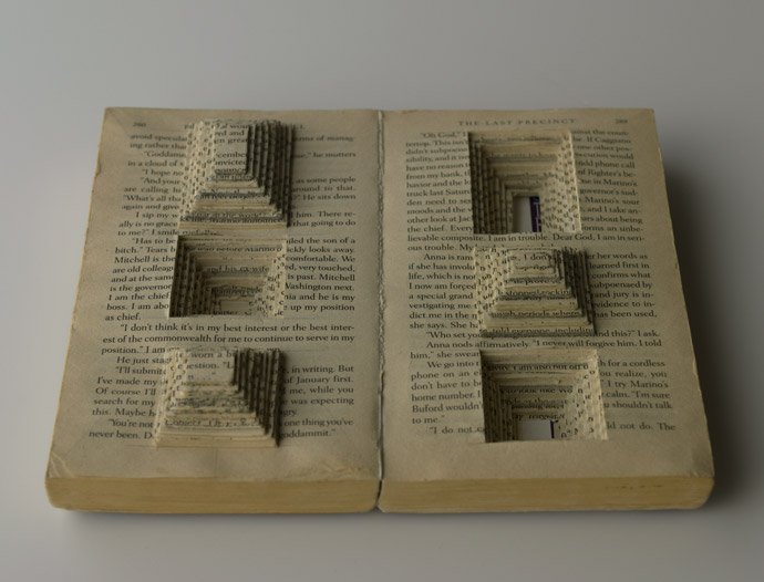
This is one of many "book autopsies" by Brian Dettmer. He carves through the books to create extremely intricate 3D art so detailed and fragile it's almost like clockwork, making great usage of space and shape to create a sense of depth. Many of these art pieces are actually several books put together and cut through as one body to create larger, sculpture-like works. Others are modified so extensively they hardly end up looking like books, like this one:

Olafur Eliasson

Moving away slightly from the subject of repurposed art, Olafur Eliasson made her own hand-bound book by laser-cutting each page to make these highly realistic book "submerged" book sculptures.  It is really fascinating how realistic it can look when each page is cut with that degree of accuracy.  The plain white paper also makes the book look more like a canvas, and less like the art is covering up something that was already there.  It fills the canvas with negative space and draws your attention to the shadows inside the sculpture.

Missoula "First Friday" Alterations

Apart of Missoula, Montana's "First Friday" Art Series, here is an untitled piece done by one of their local librarians (Who goes nameless). It is a really simple but moving piece and concept done by the artist which includes many outside materials instead of just the book itself. The artist uses a funnel with pieces of other books and large blue letters to create a "grinder" in the the bind of the book. This gives the illusion that these are the materials used to create a great read. Also the bright red of the funnel and sky blue of the letters brings the audience's attention to, what I view as, the centerpiece of the artwork. Dope!

Wednesday, November 30, 2011


While browsing through the Humument work of Tom Phillips I came across this amazing piece of art done by artist Brian Dettmer which he dedicated to Tom Phillips. I found this book very different from most of the other humument books i had seen so far, one of the main differences i notice is that there are not additional pictures painted on the book, there are no drawings on the pages, also the total shape of the book is not square anymore. The only kind of editing done to this book is by cutting the edges and the pages so that it reads as one page but actually it's total of 360 pages. There are not lots of colors used not so many mediums used and yet it looks so unique and the hard work done speaks for itself. This is a real work of art and is now present in the Ashmolean museum.

Tuesday, November 29, 2011

1000 Journals Project


The 1000 Journals Project is an ongoing collaborative experiment attempting to follow 1000 journals throughout their travels. The goal is to provide a method for interaction and shared creativity among friends and strangers. This awesome idea is only slightly flawed in the sense that you have a better chance at winning the lottery than coming across one of the original 1000. There is is this new 1001 journals (i think thats what its called) that you can go to and request a journal.

Monday, November 28, 2011

Nicholas Jones

P1011832Copy of P1011984-1

Nicholas Jones is a known sculptor who uses books and printed paper to create incredibly involved artworks. He transforms discarded books by folding, tearing and sewing to highlight the poetic nature of the book as a sculptural form.One of his reasons for choosing books as his object was because he loves the fact of a ready made object being changed/converted into a totally different object. Like others, he has also faced the scrutiny of "damaging" books due to his artwork, but he says that comes with the job!

Fragile Industries Studios

Custom Altered Book Altered Art custom wedding gifts

Though the artist doesn't present her name.. her website shows tons of material of book alterations. Apparently it's what she specializes in, but she also does shrines and other various things. Her technique is a little different than most examples I've seen because she covers each and every page with art and pictures (like a scrapbook) without using any of the actual lettering from the books. She also types up what she wants to put in the book herself, to glue in. She explains that the purpose of her work as an artist is one of revelation. Her work is detailed and complex so that something new is revealed withe very viewing.

Rebecca Sawyer

Altered Book Artist Rebecca Sawyer Interview

Sawyer sums up her idea for a altered book with drawers and niches in this explanation she gave in an interview:
"I started creating altered book and mini albums after painstakingly digging through our family genealogy. It was then that I realized, how important it is to document our current times with photos and bits and pieces of everyday ephemera. I have been on a 10-year quest to help others to preserve their precious memories in a safe, fun, and interactive environment."

Her books are definitely interesting and interactive. It ups the ante on just a regular scrapbook, while making it more original and interesting. Though the process is extremely time consuming, Sawyer says her biggest struggling what getting over the fact that it is a book, and cutting it up goes against what she's always been taught. I can definitely relate to this, because painting the first page of my book for class was heart wrenching!

Sunday, November 27, 2011

Barton Lidice Benes


Barton Lidice Benes is an artist dating back to around 1974. This specific piece is titled Livre Censure (or censored book). He started this technique after being on a train going to Philadelpha and was reading a biography about Nixon. He started scratching things out as he read it, and by the time he reached Philadelphia he had basically scratched out the entire book. After that, he started nailing books shut and tying them up.

Shauna Palmer

This piece is by a young artist by the name of Shauna Palmer and is a part of her Altered Book series. One of the many things I love about this piece is her use of different mediums to put together a magnificent pair of pages. Bringing together old photos, stamps, colored pencils, sharpies, and the text itself creates layers within the composition and adds irony to the text " two more Clean white sheets of paper" located on the left page. Also, using the text to build a crown on top of the baby portrait is pretty creative in my eyes.

Craig Paul Nowak

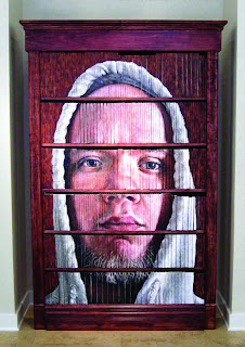
"I paint to show my audience what they most often take for granted, that which can not be seen, only felt. And in doing this, I must remain open to infinite possibilities because with limitations comes slow yet immanent demise. Just as well, the use of a single method and medium remains an insufficient means of discussing a complex binary such as that of yin and yang, or in this case, the connection between a man’s soul and the man himself." -Craig Paul Nowak
This Piece by Craig Paul Nowak is a self portrait on a full book shelf. The use of a common house hold structure as his canvas allows him to build or take apart a connecting piece. If three books were removed, the image would not be the same and if the books were rearranged, a viewer may never know that it was a portrait at all to begin with.

Tuesday, November 22, 2011

Gordon Parks, American Gothic, 1942

Gordon Parks is one of the most influential artists of the 20th century and is best known for his work as a photojournalist. His images display an enduring message of hope and are very carefully juxtaposed.

Sunday, November 20, 2011

Mark Langan

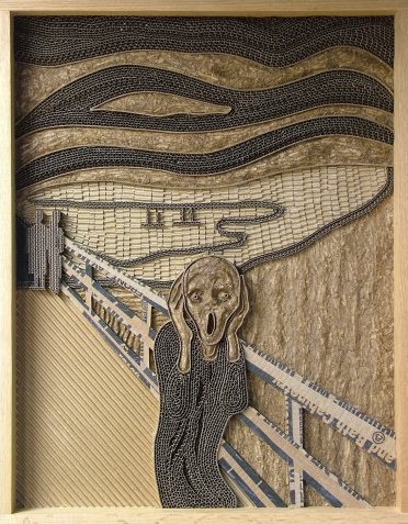
Mark Langan makes what he calls "Corrugated Art."  He takes pieces of cardboard and turns them into artwork exclusively by cutting, bending, and wrinkling the medium.  It is a particularly interesting form of repurposed artwork because the object retains more or less its original form.  The majority of repurposed art is made by putting together lots of objects so that they achieve some form or by painting over an existing paper in a book.  Langan's method is innovative because it does not involve adding anything to the cardboard.  His creations are made only through creating textures by exposing the inside layers of the cardboard, and by cutting designs in the surface.  Adding ink is not involved.
This piece is by Alexander Korzer-Robinson and it is one of his alter books. In this specific book, he has cut around all of the illustrations throughout and ended up creating a brand new "picture book". The entire composition was improved by the inclusion of the navy border of the book, which brings the audience's attention to the middle of the piece and gives the feeling as if your "seeing inside of the book.

Sunday, November 13, 2011

Su Blackwell

Wow! Patience is really a virtue. This great piece was done by Su Blackwell. The altered book was made into a pop up book through the patient use of the Xacto-knife. Instead of just slicing and dicing all of the pages like the below artist, Brian Dettmer, Su has taking the scraps and created 3-D shapes which end up giving the book new life.

Friday, November 11, 2011

Brian Dettmer


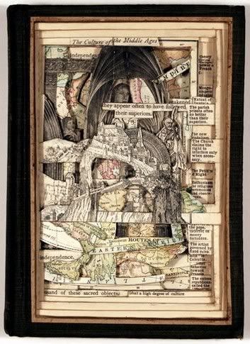
Brian Dettmer is a sculptor who has a specialization in using books as his medium for sculpting. His techniques are really interesting and he has a large variety of different book alterations. He takes a book and uses the title to create a piece related to the title within the book itself. I really got a lot of inspiration from looking at his pieces and you should google him and search for some of his stuff. His utilization of space within the sculptures is magnificent and you really get a sense of the depth within the piece which has a profound effect when viewing his pieces.
This is one of the pieces where he really utilized the title of the book with the thought process of creating the piece. He created the anatomy of a human skull inside a textbook on anatomy. All of his work is inspiring and contains plenty of wonderful idea we could use for our project.


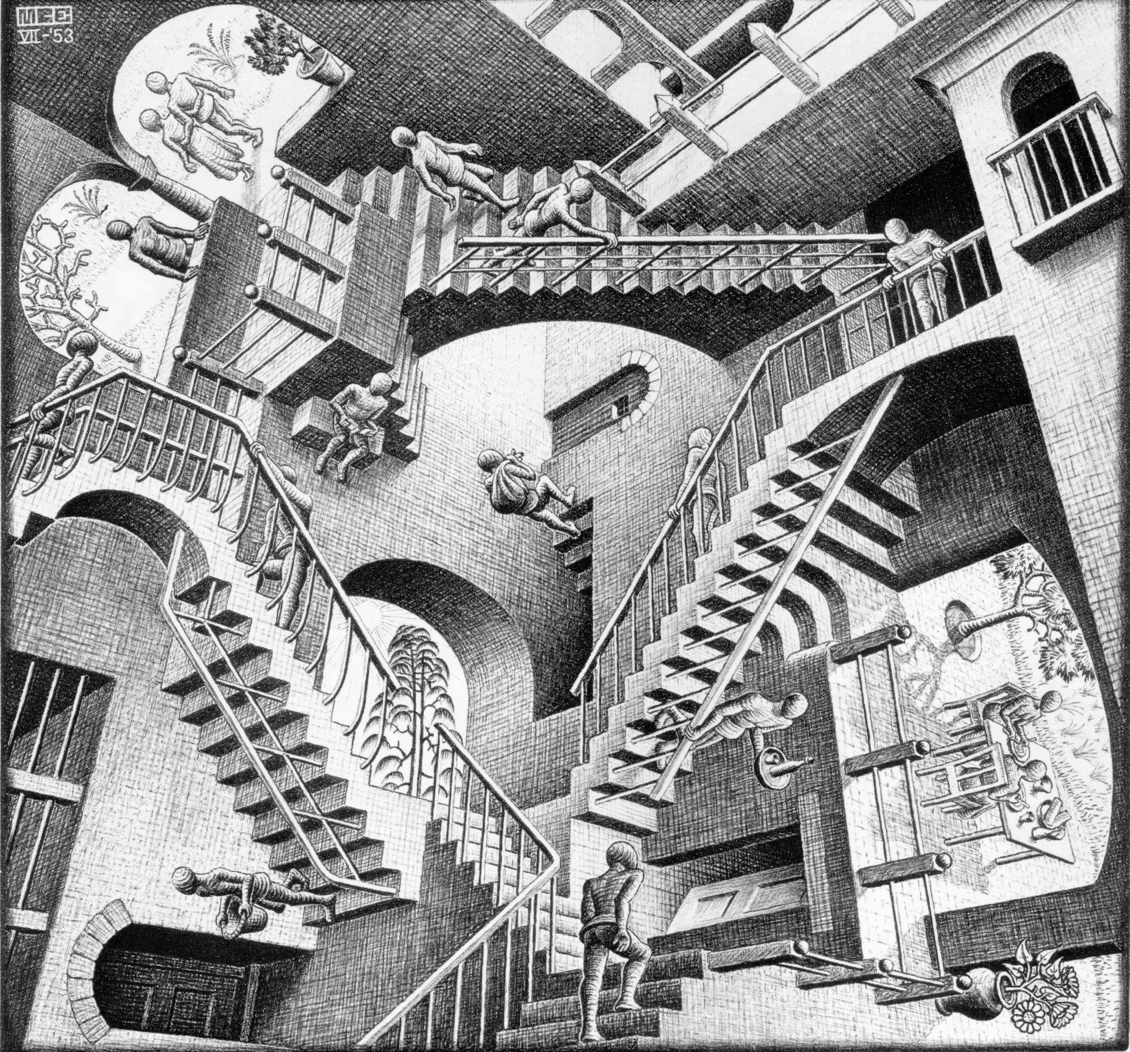
MC Escher, Relativity

So this lithograph is absolutely insane. The way he completely distorts your understanding of perspective is astounding! While this image lacks color the lines and the wide range of value probably does it more justice than color would have.

Wednesday, November 9, 2011

Nothing is what it was intended to be, in the hands of a creative person.

Repurposed art speaks further than the aesthetics and into the depths of society as a whole. Human waste is out of control, and the United States throws away far more than any other country. It is intriguing to reconsider what an average person may consider waste and to consider it a work of art...here is an article in the times you should read about Lisa Occhipinti.

http://www.nytimes.com/2011/04/28/garden/28qna.html?_r=2

Here is an example of Lisa's work:

Tuesday, November 8, 2011

recycled words
by Will Ashford

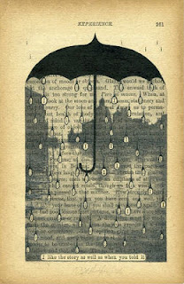
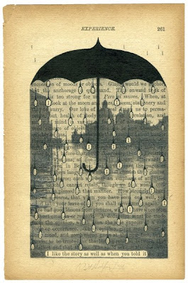
i like this page because there are three parts to it. the first thing that you might notice is the umbrella, since its darker than anything else on the page, the next would be the raindrops , if you look closer each drop contains an i which goes along with the sentence at the bottom. a lastly the portrait in the background , which gives the feeling of being there in that city holding an umbrella in a storm.

Sunday, November 6, 2011

Will Ashford


Some really great examples of altered book pages by Will Ashford. He makes very visually interesting use of both his own media and the text of the book he has chosen, and has interwoven the images so well into the text that it almost looks like it's part of the book itself. He creates a dark, enigmatic feel in a lot of his pages that draws the viewer in and makes them wonder. He has some more excellent examples on his website that might help anyone having trouble incorporating text and media in a cohesive way.
This is a self-portrait done by Pablo Piscasso in 1907. The painting was during Picasso's cubist period which was also the same time he painted the famous Les Demoiselles d'Avignon. The painting displays a design element that is extremely prevalent and makes the image extremely great. Picasso uses asymmetry on the left side of background to lure the audience into a false sense of security and keep everyone off guard. Like in all of his works, he tries to paint something the audience hasn't seen. He does just that.

Humenent : Pottermore


This is a video of J.K. Rowling speaking about a new website experience, Pottermore. The video displays graphics of a book being designed through cut outs of the pages of the book to create other images. I think this is a very unique way to approach the 'humenent' idea that we have been talking about in class. In addition, the way that it was presented to the public was especially intriguing because it turned it into a digital, moving, object to tell the story that J.K. Rowling is talking us through.

Friday, November 4, 2011

Oh Isaac


Isaac Salazar-

Talk about some insane xacto usage! No formal art training just a kid with a book and a knife...
Here are the deets:

He began with simple letters and then moved on to increasingly more complex typefaces. Depending on the intricacy of the letters, each artwork takes anywhere from a day to two weeks each to complete, using only basic arithmetic and an exacto knife as he does. He derives his inspiration from the content of the material he is working with. For example, he carved a recycle symbol on Robert Lamb’s A World without Trees.

An advocate of alternative energy and recycling, he rarely uses new books, but opts instead for books that may otherwise go to waste. He cuts, folds, and slices carefully, so as to preserve the books’ integrity. Recently, he has ventured into logos and symbols—an area he would like to pursue further.


Historic Events as Repurposed Art


This sculpture made by two Cuban artists Alain Guerra and Neraldo de la Paz is entirely made from old shirts.  The sparse use of color and near-symmetry are very powerful.  It's particularly fascinating, because I imagine it would be very difficult to build a sculpture using objects as big as shirts.  Each shirt would need to be very deliberately placed to give it the realistic aspect it undoubtedly achieves.

Wednesday, November 2, 2011

Francis Bacon

Self Portrait Francis Bacon painting


     Above is a self portrait painting by Francis Bacon. This particular self portrait stood out to me because of the many different perceptions the viewer can get. To some, it looks as though he's drunk or hungover. To others, it is a reference to life and death. Another way viewers, including myself, see the self portrait as something much more deep. Some think that his hidden wrist is bleeding into the sink from self mutilation. I think that (if that is the case) it is an extremely interesting concept and something you really have to look for, like the red in the outline of the bottom of the sink. 
     I also like the reflection behind him. It makes it appear as though he is ashamed of himself which adds more to the overall quality of the concept.

Monday, October 31, 2011

Ryuta Ida

Ryuta Ida is a Japanese artist and you can find some collections of her work at http://ryuta-iida.com/. I found this piece while searching for inspiration for my book alteration project and thought I would share it with the class. I particularly liked this alteration because of the spectacular use of negative space within the piece. When the book is closed tightly it would have an unaltered appearance but once opened would reveal the harshly defaced interior. The amount of precision work and time this would take really shows the artist's dedication. I suggest you take a look at her site and view some of her other work. It is quite fascinating.

Picasso to Warhol

Constantin Brancusi Untitled (Double Exposure Self Portrait), 1933-34

This double exposure is an amazing image. It really makes me appreciate the old darkroom. This photographic technique implied in this self portrait demonstrates the artists personality and skills outside of the sculptural medium.


I

Fernand Leger, Propellers, 1918

This painting is by far one of my favorites on display at the High right now. The fluidity that flows from the shapes allows your eye to easily canvas the piece without being all broken up by the bright colors. The harmonious combination of both the geometric and organic shapes really makes this painting dynamic.

*If you have not seen this exhibit, go see it! There is free museum entrance every first saturday of the month for Fulton Country residents*

Sunday, October 30, 2011

Frida Kahlo

Frida Kahlo painted numerous surreal self-portraits that often reflected her physical and mental pain, products of an accident that occurred when she was younger. I think these really highlight the idea of the "self-portrait," embodying one's own feelings and inner self.

Moby Dick in Pictures


Former high school english teacher and current artist Matt Kish, has spent the past 500+ days illustrating each page of Henry Melville's novel Moby Dick. That's one drawing per page, per day for 552 straight days. “Friends often question my obsession with the novel, especially since I am not a scholar or even an educator any longer, and the best explanation I have been able to come up with is that, to me, Moby-Dick is a book about everything,” says Kish of his hobby turned artistic business venture.

Project blog here
The finished project can be purchased here

Saturday, October 29, 2011

Minimal Color Usage-POWERFUL


Less can be more quite often when it comes to color usage. The values in Sharon Cutt's portrait are not super intense, but the color she does use comes across very intensional. She builds an intense image without traditional use of intense color. Check it!

Thursday, October 27, 2011

Mario Wagner

I recently read an interview on artist Mario Wagner and I must say that I really love this guys work. In a nutshell, his creative process is a mixture of old cut out images, some acrylic painting, and his mac for final touches.


Check him out more at http://www.mario-wagner.com/

Tuesday, October 25, 2011

Self Portrait


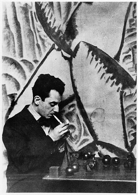
Man Ray, Self Portrait 1921

Man Ray is one of my favorite photographers. His images have this very soft and subtle look which gives the photographs an almost painted like look to them. He also has this great way of composing his images which make his images exceptionally strong.

Sunday, October 23, 2011

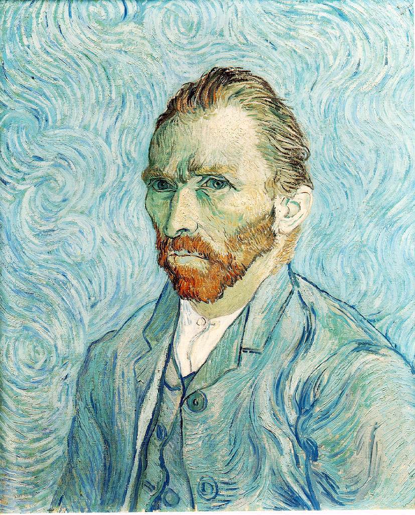
Vincent van Gogh, Self-Portrait

This is one of my favorite self-portraits done by van Gogh. His pose, position, background, and colors all are used to convey a extremely melancholy state for the artist. The colors of the background and colors of his suit jacket end up blending together, creating a wallpaper effect. Though, I believe, this is not lost on the artist. He uses this effect to bring more attention to his face which is accented with his bright red beard. Van Gogh clearly understood how to make effective compositions.

Saturday, October 22, 2011

A Conversation With Myself Part I


I came across this self portrait (photography) and it captured my attention in first sight. On Flickr I was able to find more self images of the artist. I found Hani Amir's style very unique and interesting. what i found most interesting about his photography is that he uses natural lights, natural poses and as less use of Photoshop as possible. he says "I can use the make the light burst on Photoshop but where's the fun in it?" I like his attitude towards artificial effects.
In this picture Amir uses mirror to get the reflection of other half of his face, he tilts the neck and sets the camera in such angle that in one shot taken with tripod gives the image of two people in which one of them is victim and the other one is potential killer but it's the same person.
I love the subject matter of the photo, something i can personally relate to. Cherry on the icing is the perfect lighting and use of complimentary colors(Blue & Orange) with black. Even though he used complimentary colors it doesn't give an extreme highlight and they are not "in your face" there is so much black that it takes over the colors. personally I am fond of black in most of my work because of the power of the color, so in every way i Love this self-portrait of Hani Amir.

Tuesday, October 18, 2011

Photographic Self Portraits


These are all really great photographic self portraits. I really enjoy how each portrait is drastically different from the other, and you really do feel like each one is successfully digging deep into the artist's personality.